
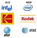
 It seems the "in" thing to do right now is re-invent your company logo. Intel, Kodak and AT&T have done this so far, with dubious results. I hope they didn't spend too much money on the designs, because I don't find them very spectacular. Do you notice anything similar between the new logos? Everything is more curvy.
Thanks to Paul Kedrosky for the find.
They look like an elementary school student came up with them...maybe that is who they are trying to attract with them.
ReplyDeleteThe Kodak one is horrible but the other two are improvements.
ReplyDelete